 30 in Design
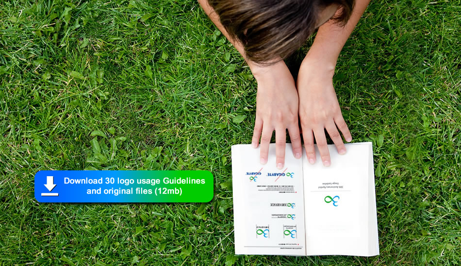
In 2016, we celebrate our 30th anniversary, a major milestone of great competence and enterprise mobility. This success over the past 30 years is as a result of an unremitting pursuit to "Upgrade Your Life". Fundamental to this spirit and a visual element of "∞" are the core concepts of GIGABYTE 30th anniversary logo, designed by Brand Marketing Management Division.
The symbol of "∞" illustrates an infinite future while lines with sense of progress represent our relentless focus on innovations. The combination of blue and green colors embodies a symbiotic relationship between our core business and sustainable development which drive all of us to create a greater whole.
This GIGABYTE 30th anniversary logo is a graphic representation of the values for which GIGABYTE stands for decades. The total integration of our core values of innovation, quality, service, efficiency, brand and CSR will allow us to uphold the essential promise of our brand: to upgrade your life and make the world a better place.
Happy 30th anniversary, GIGABYTE, and here's to many more great decades to come!


